Goal
"The goal is to individualize and clarify the abstract risks of flooding and heavy rain, ensuring citizens understand their personal vulnerability and are empowered to directly implement tailored prevention measures."
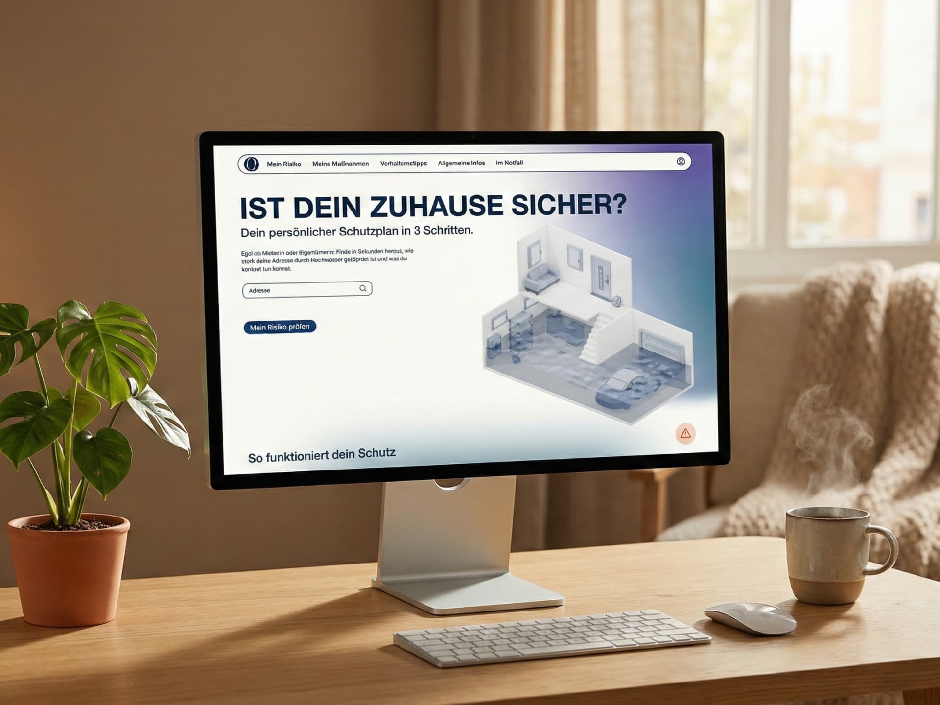
is a digital tool for personal flood protection. It analyzes address risks and creates custom action plans. This helps citizens protect themselves effectively.
"The goal is to individualize and clarify the abstract risks of flooding and heavy rain, ensuring citizens understand their personal vulnerability and are empowered to directly implement tailored prevention measures."
As a team of three, I collaborated with two interaction design students to combine our different skills for this project. This collaboration allowed me to contribute a unique IoT perspective and fresh ideas to our shared work. Toward the end of the project, I specialized in the technical development.I used Generative AI tools and built the prototype with Next.js and SCSS to ensure the final result was polished.
Floods are increasing globally and remain the second most severe disaster in Germany. Climate change now affects regions that were previously considered safe. Because emergency services cannot intervene everywhere at once, personal responsibility has become essential. However, this requires access to clear and personalized information. Practical communication about risks and specific actions is therefore more relevant than ever.
We based our strategy on detailed research. We interviewed flood victims, firefighters, and emergency experts, and we also surveyed 44 people. This work showed a clear gap between people knowing about a risk and actually taking action. Afterwards, we developed the tool in three stages, performing user tests during each one to ensure we were on the right path.
Our design aims to convey "Trust" and "Clarity." We paired uppercase Helvetica for precise and structural headlines with Poppins for friendly, readable body text. The color palette is based on deep blues to communicate security, and we reserved signal colors, such as orange and red, strictly for urgency. Afterwards, we used soft background gradients to guide the user emotionally: blue for factual analysis and purple for the playful quiz. Everything, from the organic "O" logo to the rounded icons, was crafted to be accessible even in stressful situations.
For the visual language, we chose a "Low Poly Realistic" style. We kept the architectural base white to avoid visual overload, while interactive objects use our branding colors, such as Slate Blue and Dark Navy, to stand out. To overcome our limited modeling expertise, we built a custom AI pipeline. In this process, Gemini generated consistent 2D isometric images through strict prompting. Next, Hunyuan Tencent 3D turned these images into 3D geometry. Finally, we used Blender for mesh optimization to decrease the file size and improve the performance of the 3D model.
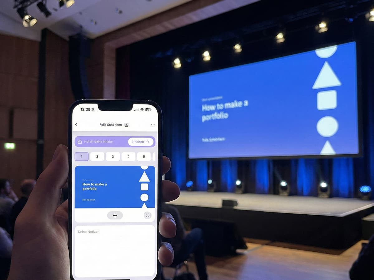
Instead of relying only on click-dummies, we decided to code the final prototype in just one week. During this short period, I developed the website based on the Figma designs as quickly as possible. While I could not guarantee perfect web responsiveness for every device, this approach allowed us to perform testing with a functional prototype. Developing the actual frontend enabled us to validate the logic of the recommendation engine and the 3D model with real users.
The landing page is designed for a low-threshold entry. Upon loading, an animated isometric house fills with water, making the abstract threat visually immediate without needing heavy text. We placed the address input centrally for instant risk checking, and included a prominent floating orange button that serves as a direct lifeline to the 'Emergency Mode' for acute situations.
Once an address is entered, users receive a precise assessment of both heavy rain and river flood risks. To make abstract data relatable, we implemented a "Human Scale" visualization: we placed a human figure next to the water level on the house model. Furthermore, we added local facts and damage estimates to demonstrate why taking action is necessary.
The "Digital Twin" is built through an interactive questionnaire. As users enter details, such as whether they rent or own and their cellar type, the 3D model updates in real-time. We ensured visual consistency by matching the design of the selection tiles to the 3D style. This approach reduces the mental effort needed to use the tool and gives users a sense of ownership over the digital home they are building.
Obacht generates a personalized protection plan that users can explore in two ways. We provide an interactive list where users can filter and sort various safety measures. At the same time, users can navigate the plan using the 3D model by clicking on specific hotspots on the house. To keep the user motivated, we included a progress dashboard and the ability to mark tasks as "Done." This moves completed tasks to the end of the list, which makes the journey toward a flood-proof home feel more rewarding and organized.
We structured the detailed view to be instantly scannable. Clear icons define the cost, time, and required expertise for each measure, such as the need for a professional craftsman. We also integrated the "Negative-Impact-Loop" into this section. This feature uses animations to show exactly what damage occurs if no action is taken, such as water entering through a door. These visuals provide a strong psychological push for prevention and help users understand the true importance of each safety step.
Structural protection is only one part of the solution. Because correct behavior is a critical measure for safety, we designed a vertical timeline to guide users through the four phases of a flood. These phases are: Initial Warning, Alert, Acute Emergency, and Aftermath. Each stage has its own specific priorities. We organized the information into practical cards, such as "Pets" and "Documents." This ensures that users can practice the correct steps in their minds before a crisis occurs.
The quiz is an essential part of the behavior plan and aims to check knowledge without causing stress. We use situational storytelling combined with pictures to present realistic scenarios. Each question features four answer options, where only one is correct and some are designed to be humorous. This approach does more than just teach safety; it encourages users to talk about flood protection with their friends and family. Ultimately, this high level of engagement ensures that users are truly ready for a flood by turning standard protocols into a shared experience.
Users can activate this mode through the floating action button or the "In an Emergency" navigation menu. Once active, the interface removes all extra design details to focus purely on the crisis. It follows a clear priority system, showing only essential survival steps and a large, red "Call 112" button. This design recognizes that every second is valuable in a real emergency, so the goal is to make the information as simple as possible to process.