Goal
"The goal is to raise awareness of climate change by transforming abstract scientific data into a tangible, visual representation of one of Australia's most destructive natural disasters."
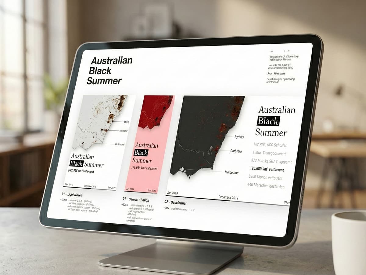
a data visualization project that renders the devastating 2019–2020 bushfires to illustrate the impact of climate change.
"The goal is to raise awareness of climate change by transforming abstract scientific data into a tangible, visual representation of one of Australia's most destructive natural disasters."
The initial development focused on rendering approximately 800.000 global data points onto a basic canvas to test browser performance. This exercise yielded a surprising discovery: the sheer density of the fire points clearly visualized the continent outlines and showed which hemisphere was experiencing summer due to the increased fire activity.
Following this global proof-of-concept, I refined the data scope to specifically target the 2019–2020 Australian season. This involved filtering the 75 MB NASA FIRMS dataset down to a focused 26.5 MB file, ensuring all retained points included the critical Fire Radiative Power (FRP) metric for intensity visualization.
I enhanced the aesthetic by integrating a custom SVG map and implementing a color scale based on fire intensity. I selected the serif font 'Prata' to give the piece a serious, editorial feel and developed a responsive layout system that adapts the visualization to Landscape, Banner, and Square formats.
The final result is a performant, interactive application featuring a timeline animation that shows the spread of fires day-by-day. Users can control the timeline to witness the disaster unfold, transforming abstract statistics into a tangible narrative about climate change.